

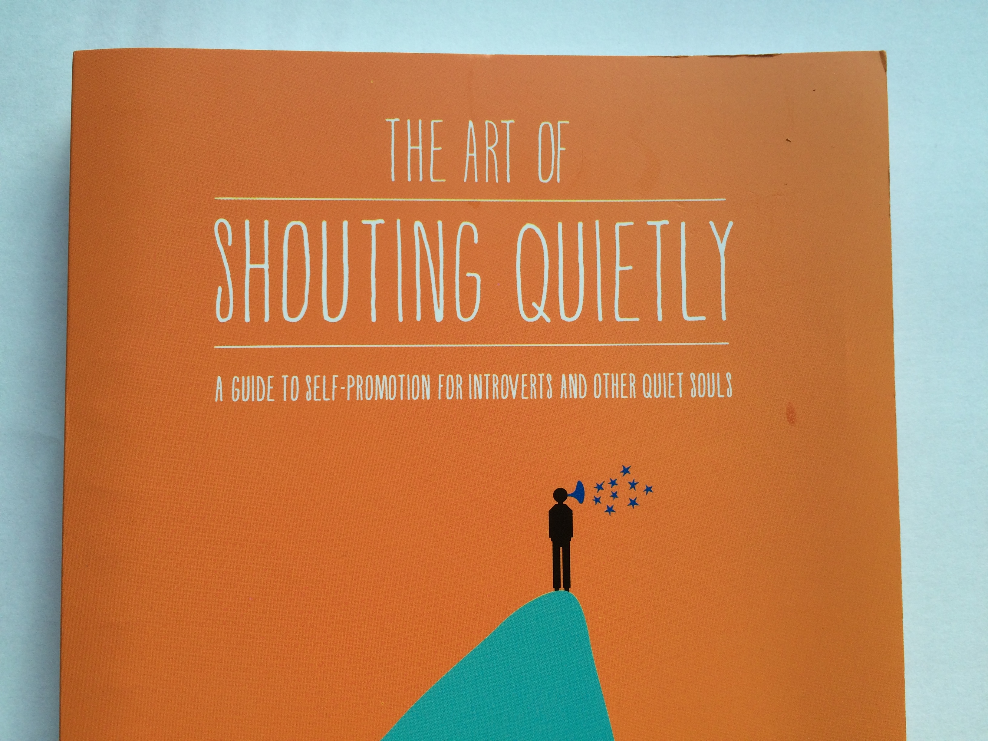
My eyes were meadering aimlessly over the fonts and designs at the bookstore and BANG! This title with two words that shouldn’t be together, grabbed my attention. “The Art of Shouting Quietly”. After hundreds of bookcovers that rendered me bored, this one fluttered its come-hither eyes at me. I went over to investigate.
The design was orange, so it stood out. The cover was simple, my kind of thing. It was a contradiction itself – both bold and unassuming. With the letters all in thin capitals, it gently mirrored those posts or tweets or texts that SHOUT AT YOU.
The subtitle “A guide to self-promotion for introverts and other quiet souls” gave a blindly obvious this-is-for-you signal to those for whom the book was written. Before I’d even opened the book, I was intrigued enough to buy it. Job done.
Create Come-Hither Titles
When you are writing titles for blogs, articles, talks, workshops, surprise people. Don’t say what everyone else is saying, or you become more noise in an incredibly noisy world. Play about with words and ideas that confound or contradict or even confuse. If the title was about shouting loudly, no-one would read it twice, no-one would care, because we’d dismiss it with a “I know how to do that.”
Find a phrase that your industry knows well and then mess it up – imagine a blog about networking that is about “Know-Dislike-Mistrust.” Because people have already heard of know-like-trust, so your phrase is familiar and yet wrong all at the same time. It hooks them in.
Get Them Thinking “That’s Me!”
Before you put pen to paper, or fingers to keyboard, work out WHO you are writing to. This author selected introverts and people-who-don’t-see-themselves-as-introverts-but-probably-are (the author calls them quiet souls). Each audience has different needs, wants and more, so get crystal clear before you start to talk to them.
Designs Should Be Invisible
A simple colour scheme, simple drawing, tall thin letters. They all echo the introvert theme, the gentle act of self-promotion. It does what it says on the tin – gentle promotes the book without being too bold, too brash, too in-your-face. That is great design – so effortless and obvious we don’t even notice it.
Dibs on the “Know-Dislike-Mistrust” blog title by the way.